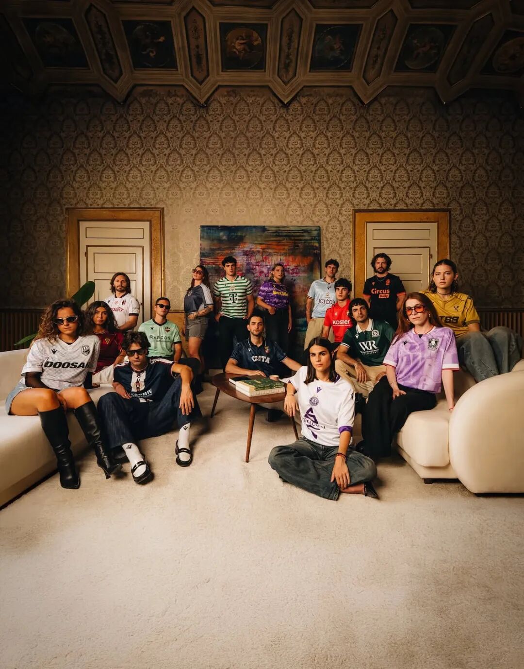
The Jersey Traffic Battle: Top 10 Most Anticipated New Football Kits of the 2026/27 Global Football Season | Barcelona, Arsenal, Real Madrid, Manchester City, PSG
From Arsenal's gold badges to Barcelona – who's wearing the real business on their backs?
The summer transfer window hasn't even slammed shut, but the second front has already been fought and won – the kit launch battle. Honestly, some of these reveals generated more buzz than half the signings. We've seen AI resurrect legends from thirty years ago, campaigns shot like road movies, and a shirt priced at nearly €200 that got fans raging on social media. Then there's Arsenal: as the 2025/26 Premier League champions, they've slapped gold Premier League badges on all three sleeves – a first in the club's history. Football shirts aren't just "clothes" anymore. They're nostalgia, technology, pricing power – and a carefully calculated war for attention.
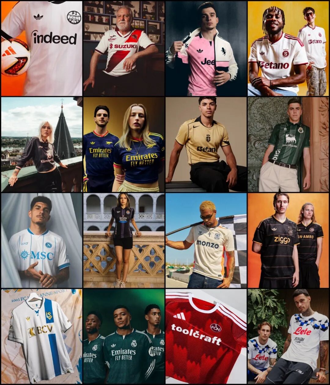
We've picked the 10 most talked-about releases from Europe's top leagues – ranked by conversation, not aesthetics (so save the arguments for the comments). Every club's home and away kits are featured below, along with international media buzz. Let's see who's turned the shirt into a business statement.
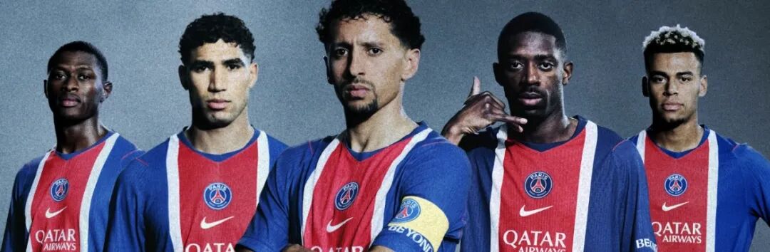
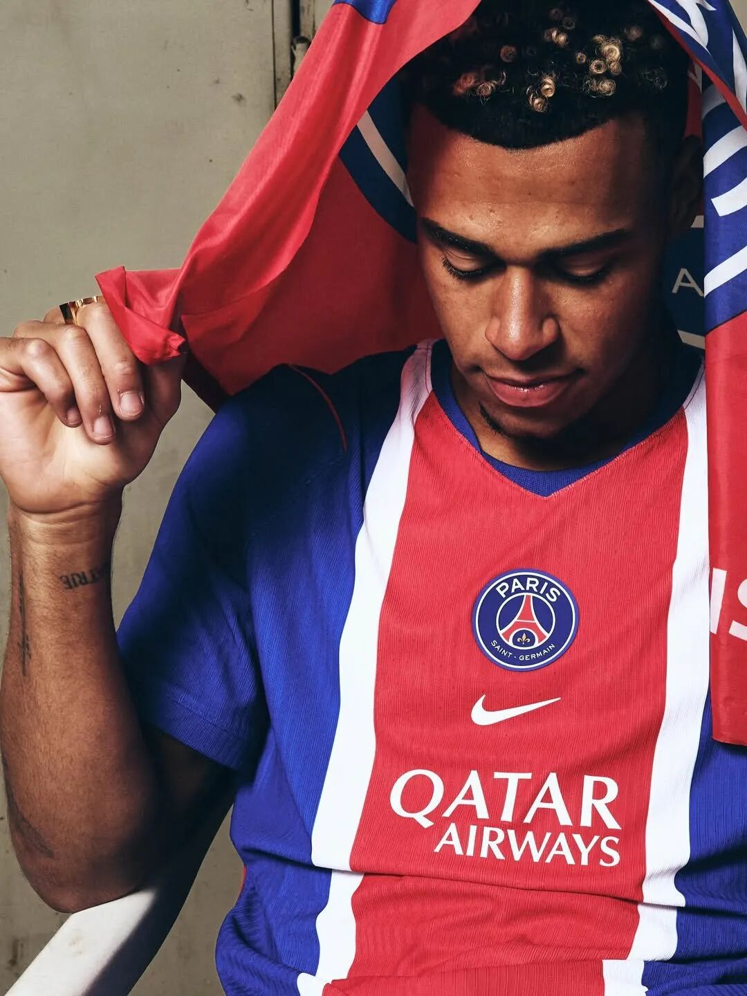
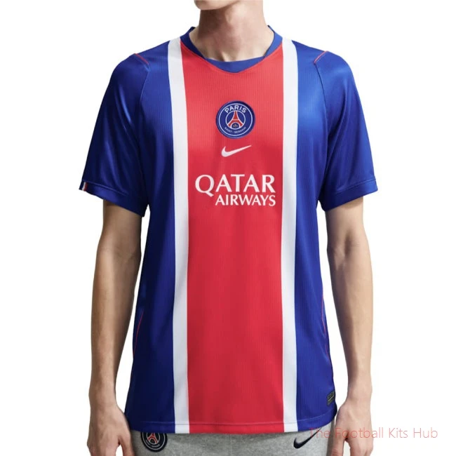
Home ✅ Launched (9 May): A lighter, brighter "Old Royal" blue – the classic Hechter central red‑and‑white stripe is wider and, for the first time, runs onto the back. The crest and Swoosh are stacked vertically in the centre, sparking plenty of debate.
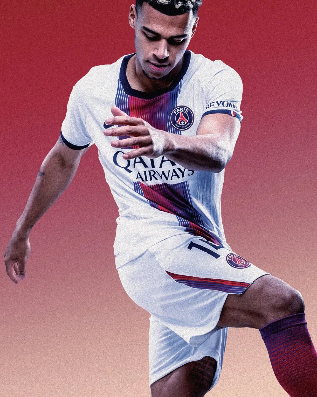
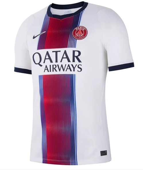
Away ✅ On sale 11 July: White base with a central vertical gradient (red to navy pinstripes), inspired by Op Art and Paris's electronic music scene. The lenticular crest changes colour as light hits it. Nike's "RIP the Script" campaign (featuring Kim Kardashian) built the hype.
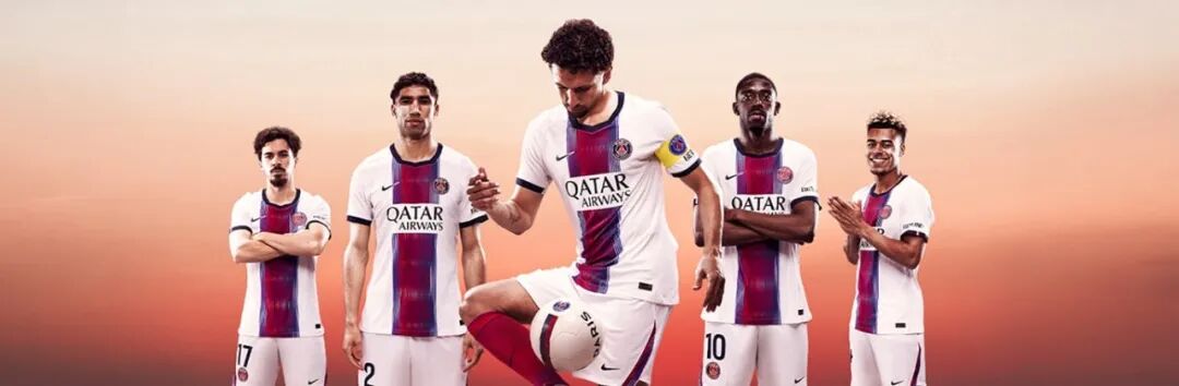
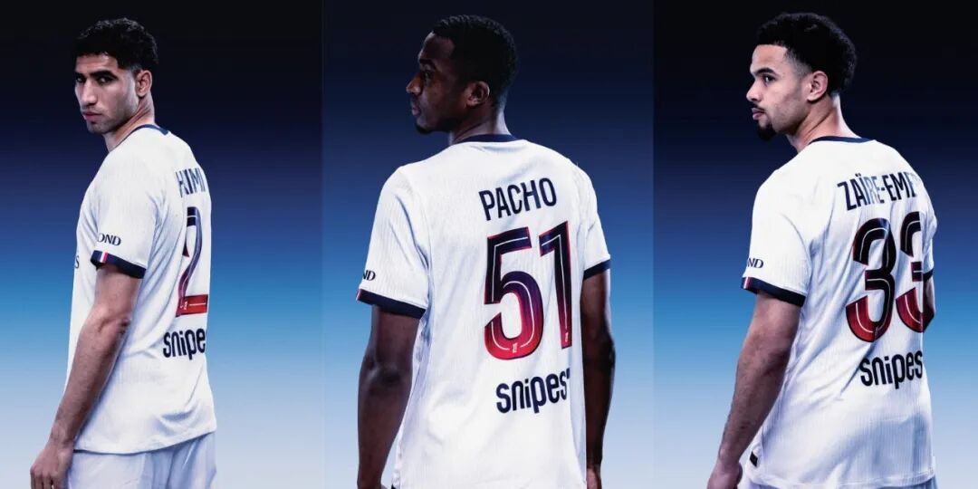
Why it's buzzing: From the retro blue to the optical‑illusion away – PSG turned design into a laboratory.
International buzz: GiveMeSport ranked the home in their "Top 10 of the season"; the lenticular badge was called "an optical experiment" by Footy Headlines.
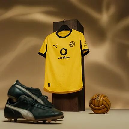
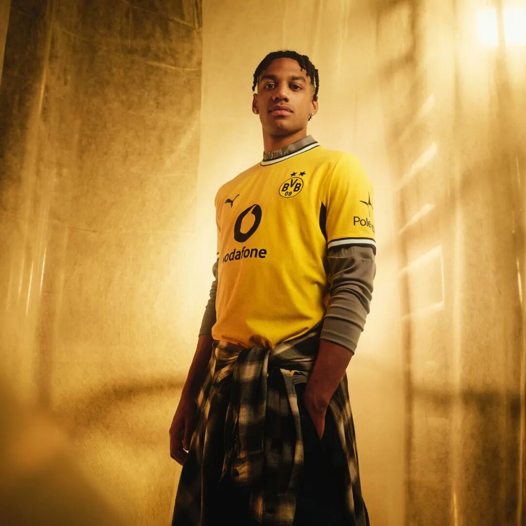
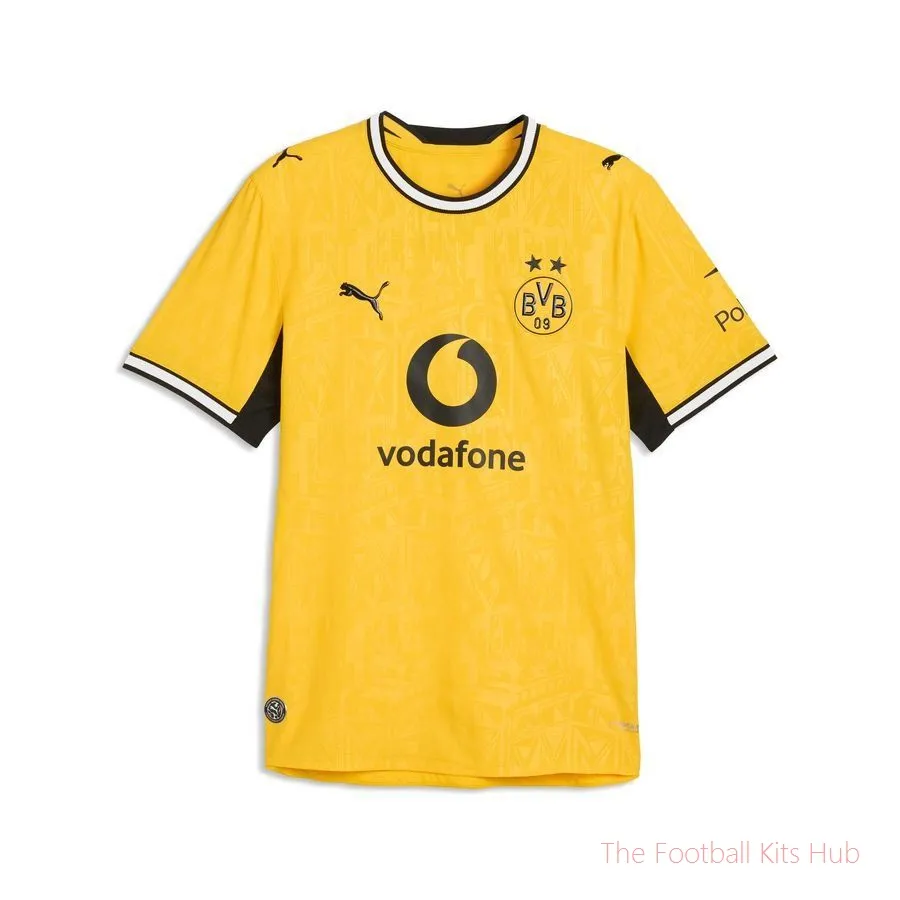
Home ✅ Launched 7 May: Yellow‑and‑black base with a tonal geometric pattern across the chest and lower body – inspired by the steel structures of the Ruhr mining region and Dortmund's U‑Tower (marking 40 years since the mine closure and the tower's centenary). Vodafone appears as the new front‑of‑shirt sponsor.
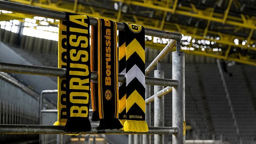
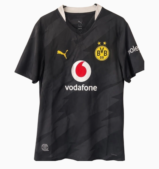
Away – a more restrained, elegant design compared to last season's grey‑and‑white. Clean lines, sophisticated palette – German media praised the shift from "loud" to "cultured".
Why it's buzzing: Industrial identity – the shirt tells the story of a city.
International buzz: German media noted the away kit's "elegant restraint", a complete 180 from last year's polarising design.
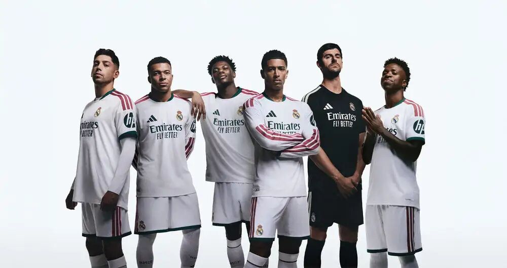
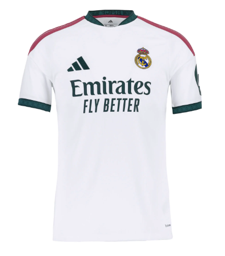
Home ✅ Launched 3 June: Classic all‑white with dark‑green and pink accents. The subtle pattern is drawn from the diamonds and pearls on the crown of the club crest. And the shoulder stripes? Bright pink – a bold move for the most traditional club in the world.
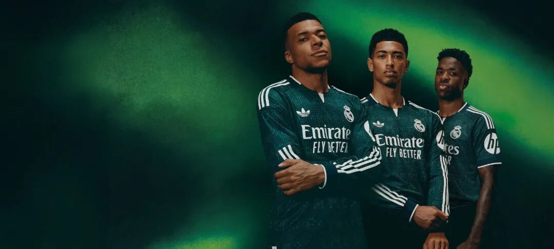
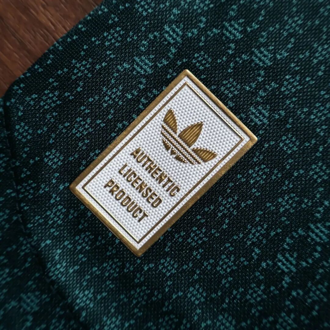
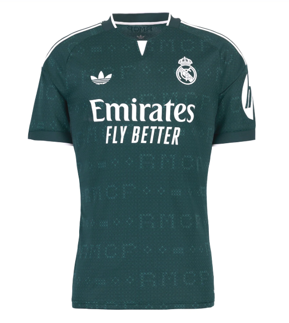
Away – dark green with off‑white details, featuring a geometric monogram pattern that spells "RMCF". The adidas Originals trefoil replaces the performance logo – a classy touch.
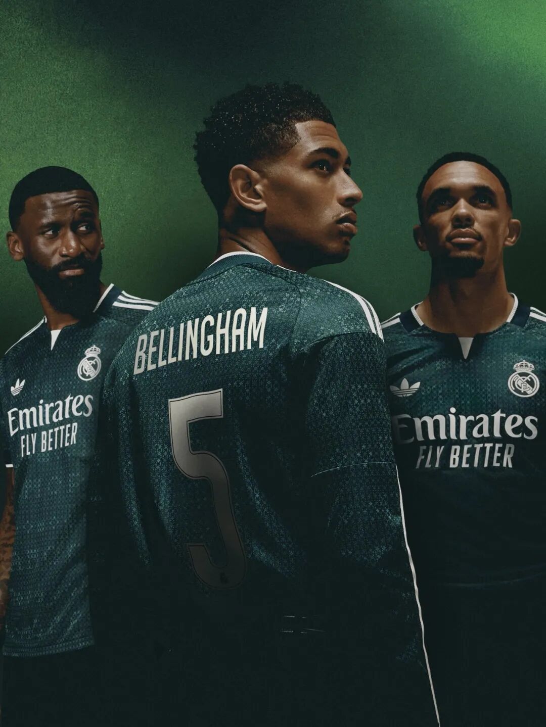
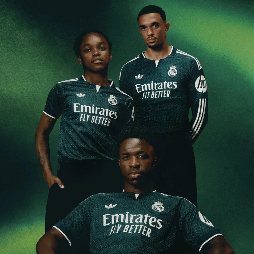
Why it's buzzing: The most "proper" club in football dares to go pink – restraint broken is always the loudest statement.
International buzz: The home kit was widely discussed for its pink stripes; the trefoil away was called "a collector's dream".
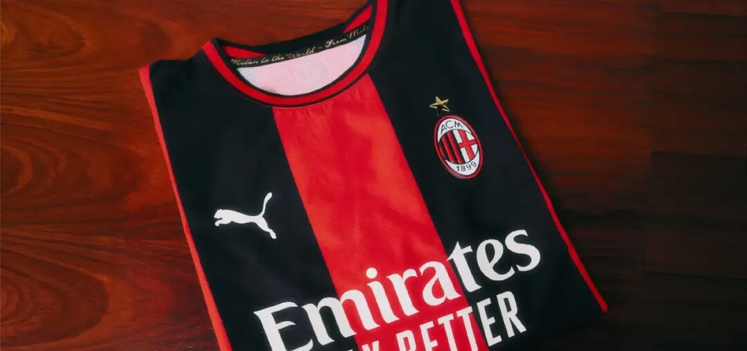
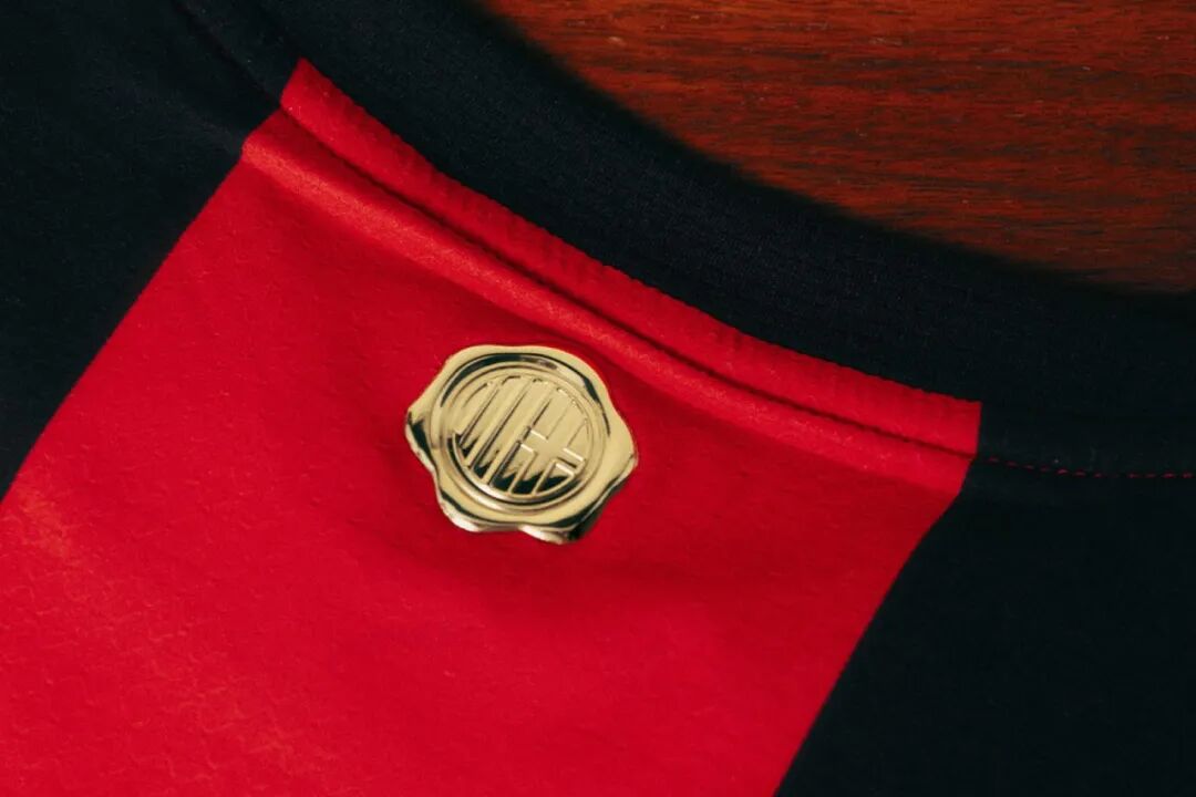
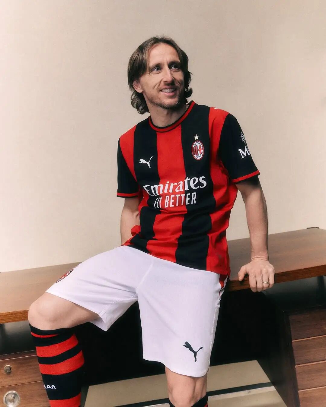
Home ✅ Launched 22 May: Bold, wide red‑and‑black stripes that run through to the back. A wax‑seal style crest on the nape, with the motto "From Milan to the World".
Away ✅ Launched 21 July: White with light‑grey pinstripes, and a gold laurel wreath surrounding the crest – honouring San Siro's 100th birthday. Filippo Inzaghi stars in the campaign, and inside the collar: "Dopo Istanbul c'è sempre Atene" (After Istanbul, there is always Athens).
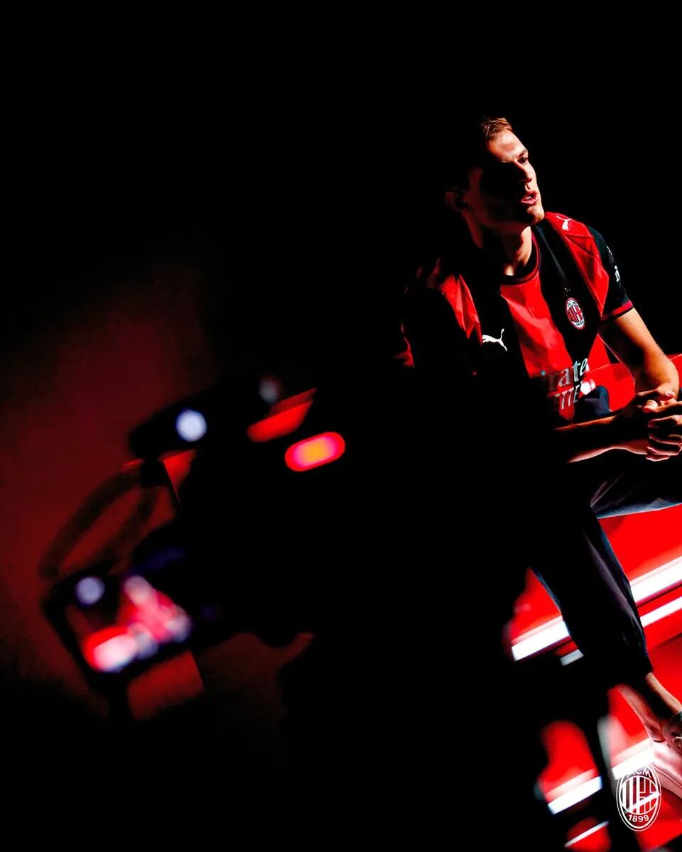
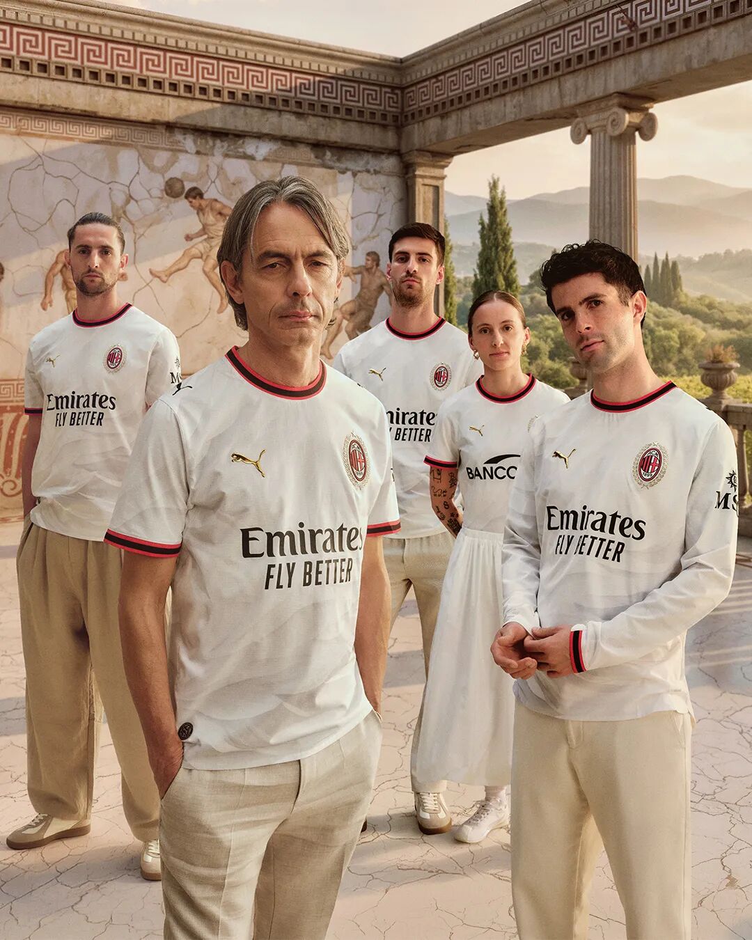
Why it's buzzing: "Revenge" and "rebirth" stitched into the collar – nostalgia at its finest.
International buzz: Football Italia called the away "a journey from ashes to Athens"; the gold laurel was praised as a "rare return to gold details".
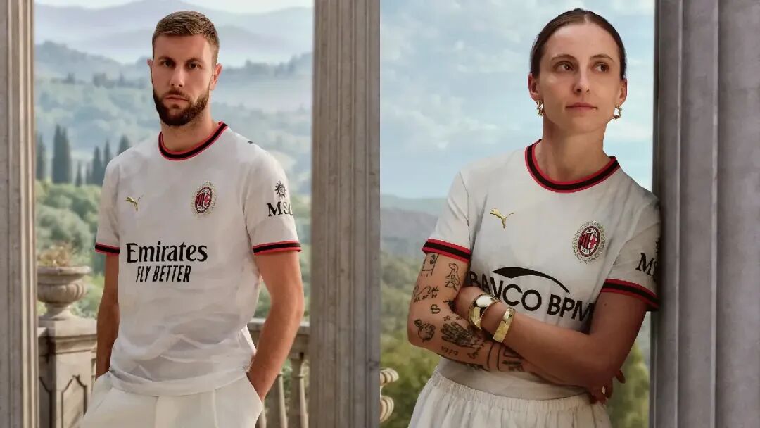
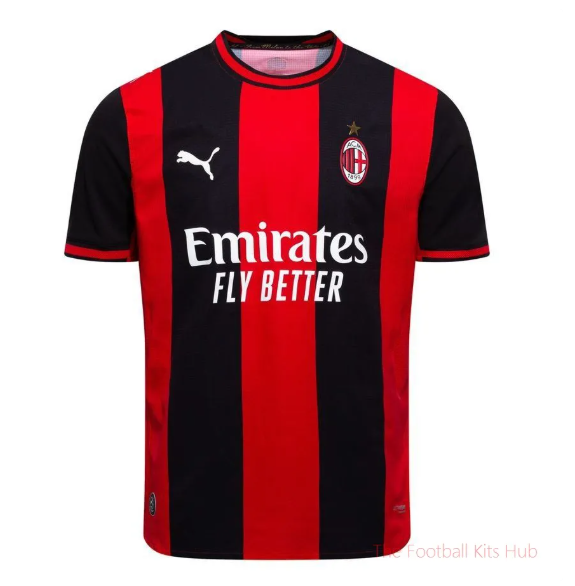
AC Milan Home Jersey
· thick stripes
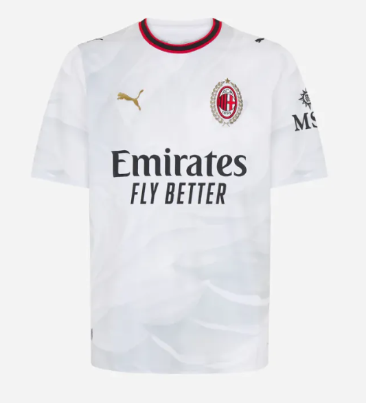
AC Milan Away Jersey
· gold laurel
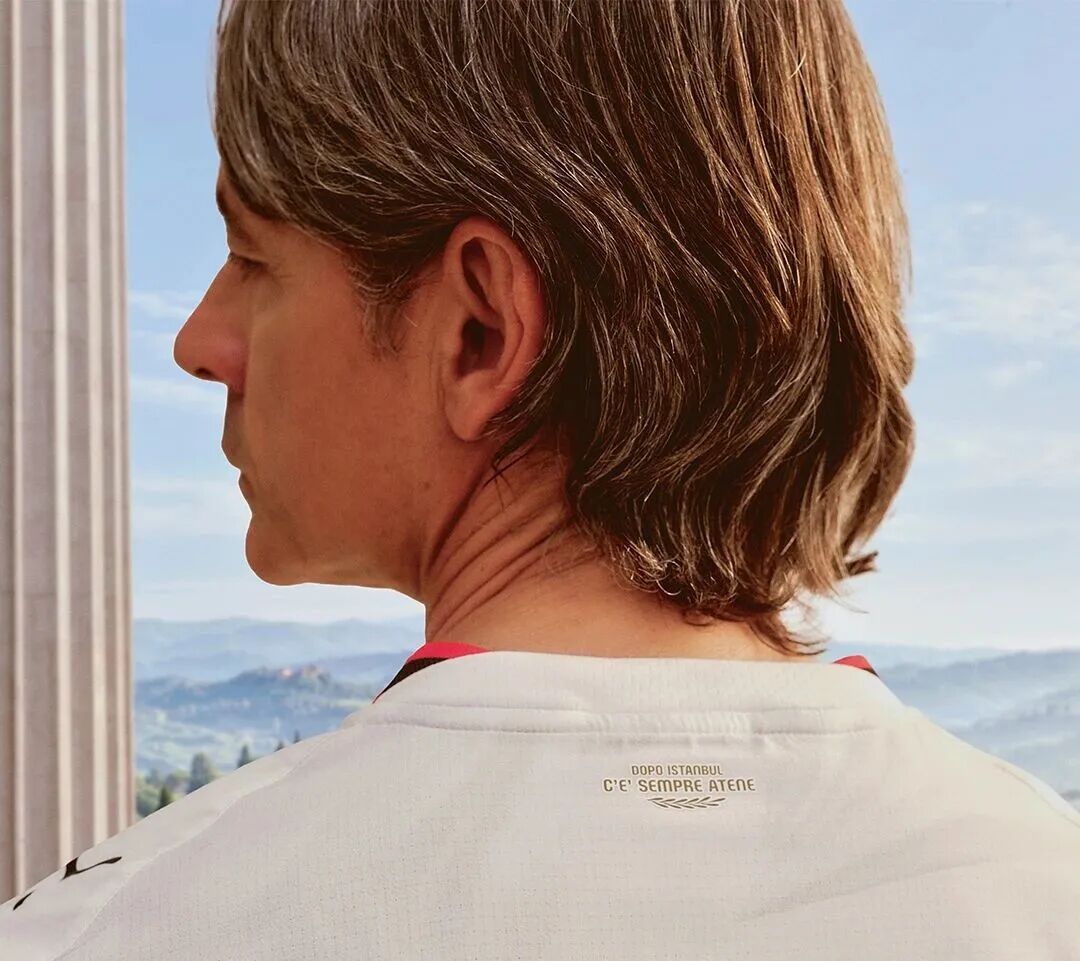
Made of Milano – tailoring meets football
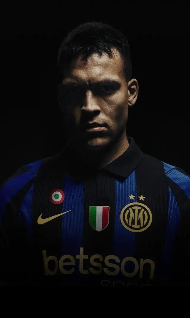
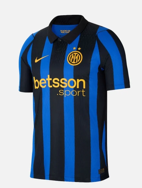
Home ✅ Launched 19 May: Black and Lyon‑blue stripes, paying homage to the 1998 classic. Gold detailing, a retro collar, and "Made of Milano" printed inside the neck. The stripe edges mimic tailor's shears – a direct nod to Milan's couture heritage.
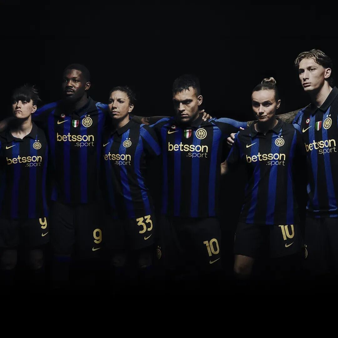
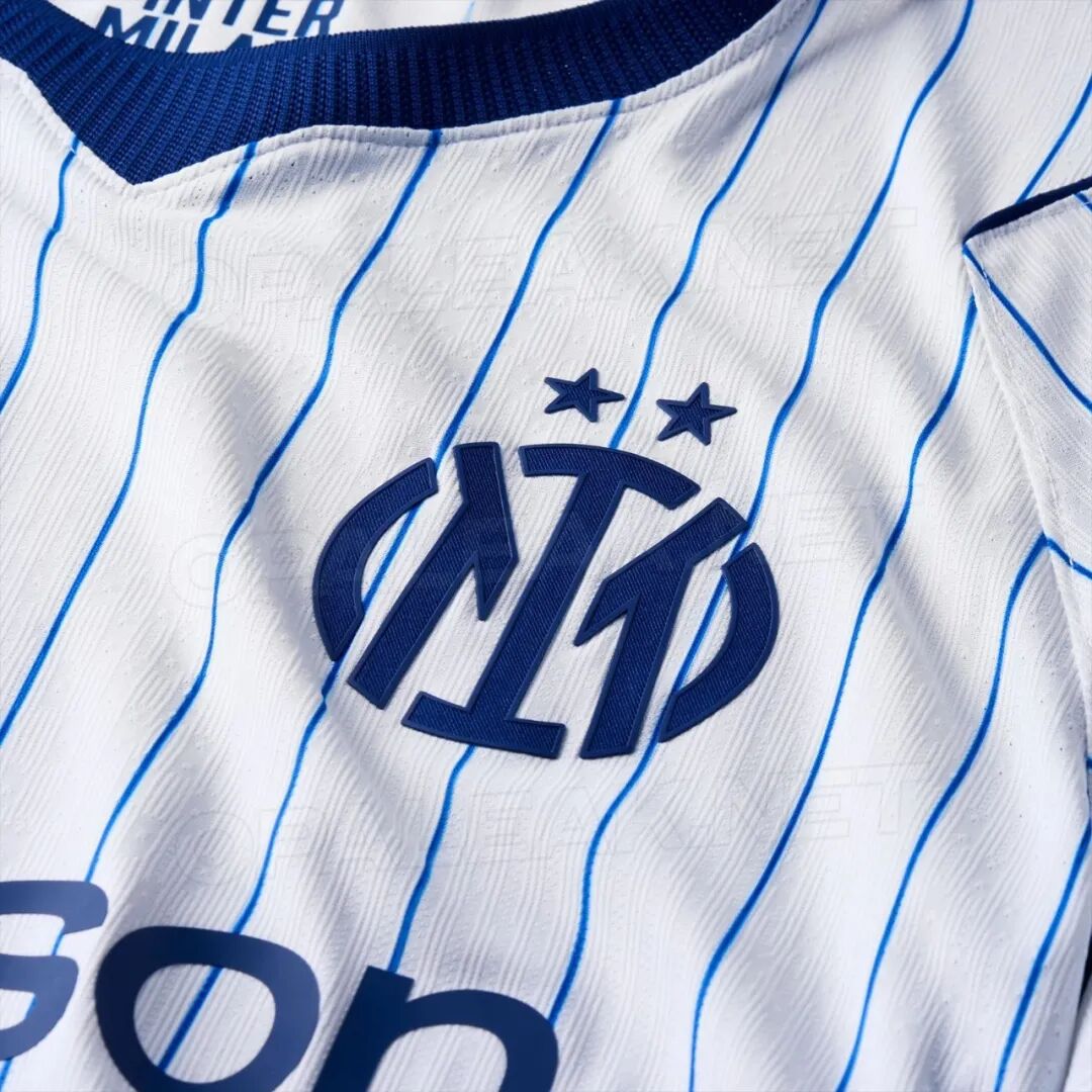
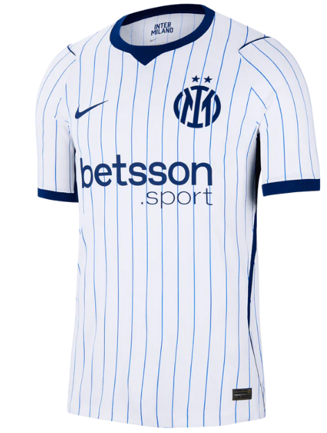
Away – a baseball‑inspired design with light‑blue pinstripes on white, and for the first time in over a century, the traditional crest is replaced by an "IM" monogram. Streetwear energy straight from the fashion capital.
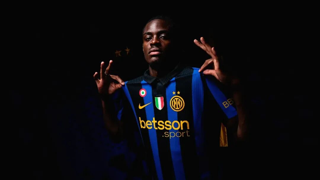
Why it's buzzing: The soul of Milan's fashion district woven into every stripe.
International buzz: Observers ranked Inter's kit as one of the "highest design completion" – the "Made of Milano" theme was called the benchmark for city‑identity kits.

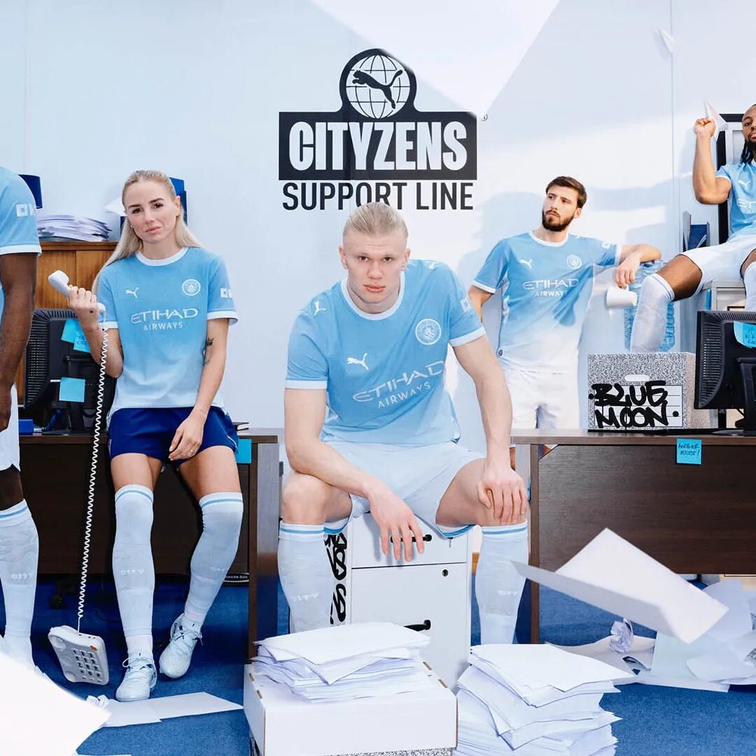
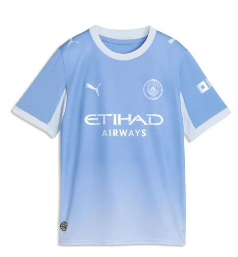
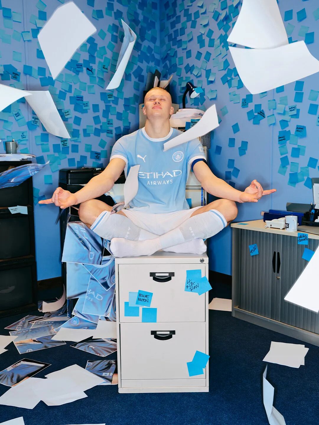
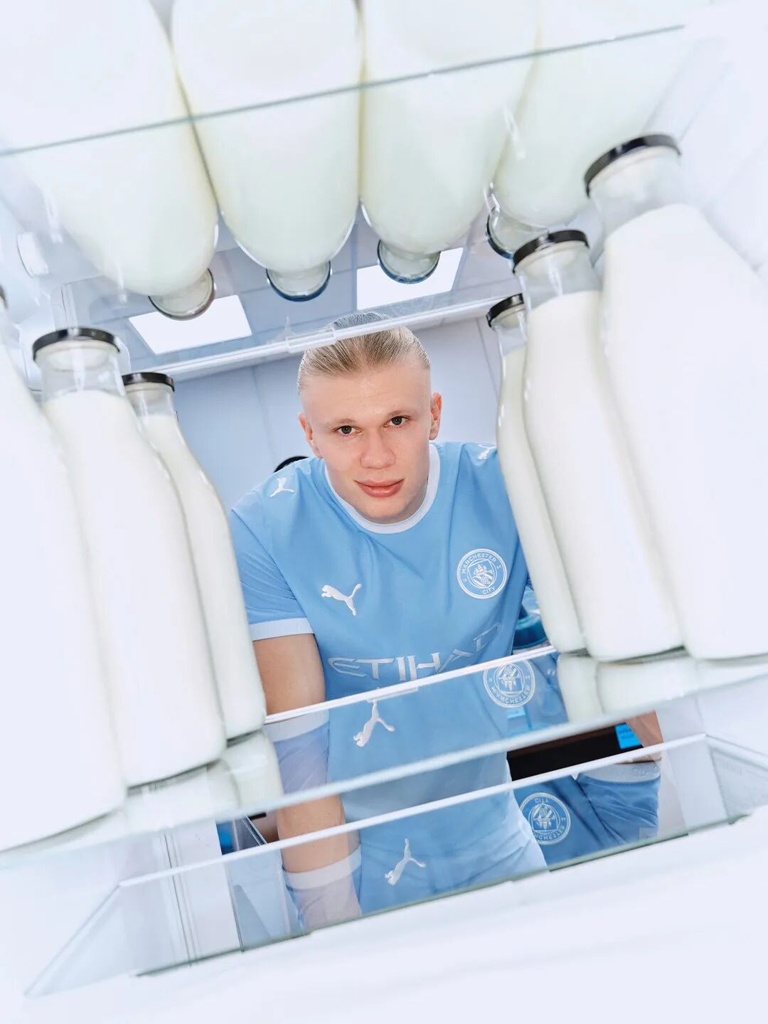
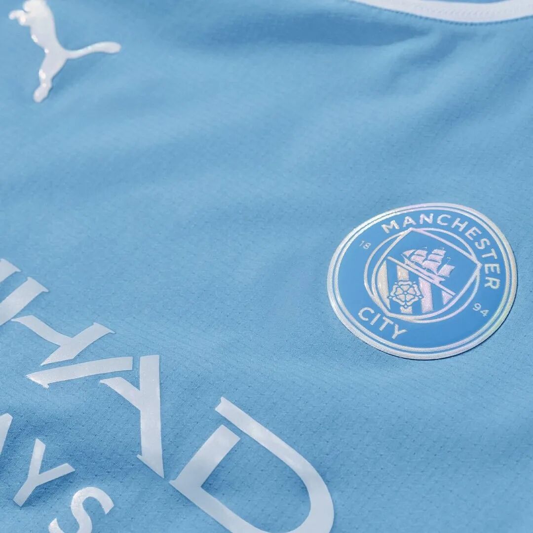
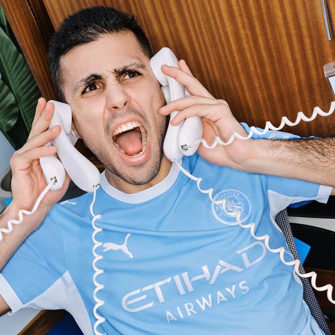
Home ✅ Launched 20 May: A continuous sky‑blue gradient that fades from dark to light from shoulder to hem. Monochrome metallic badges and sponsor logos give it a sleek, premium feel. The launch film was a street‑comedy sketch, not a traditional photoshoot.
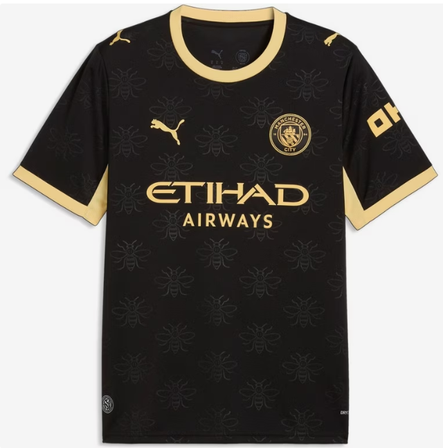
Away – a bold contrast design that flips the sky‑blue script, made for European nights.
Why it's buzzing: "Not Your Typical City" – and they delivered.
International buzz: GiveMeSport ranked the home 6th (fresh and distinctive).
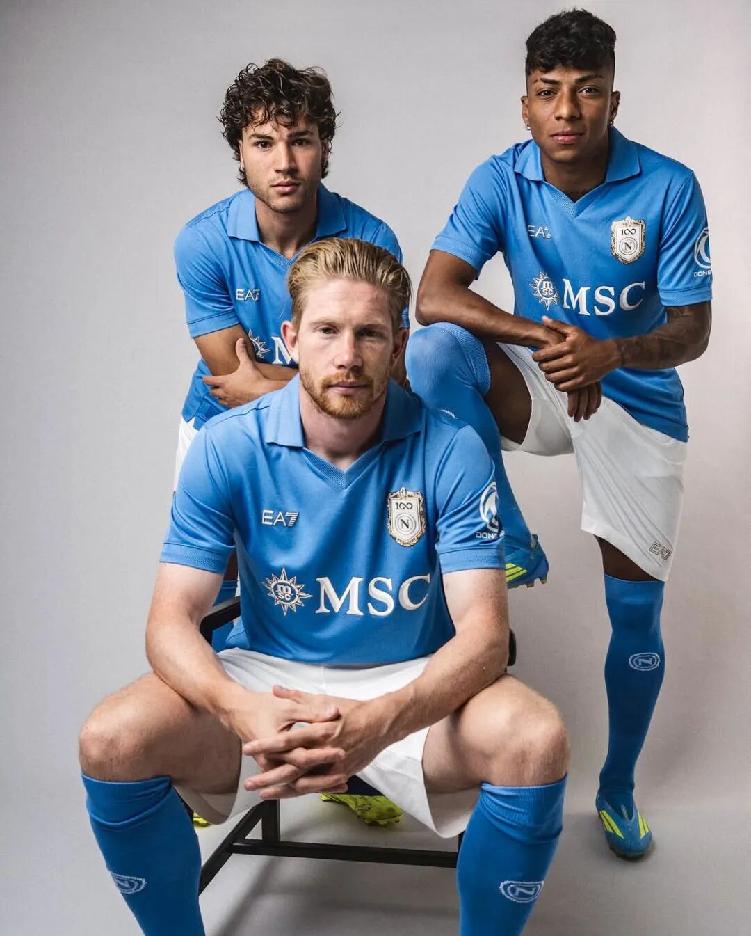
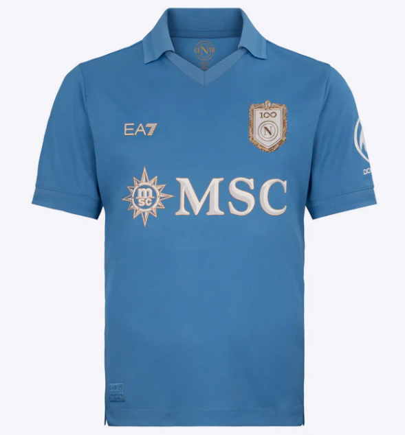
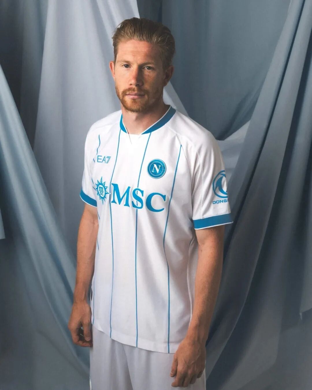
 4️⃣ Napoli (EA7/Armani)100 years – a road movie in a shirt
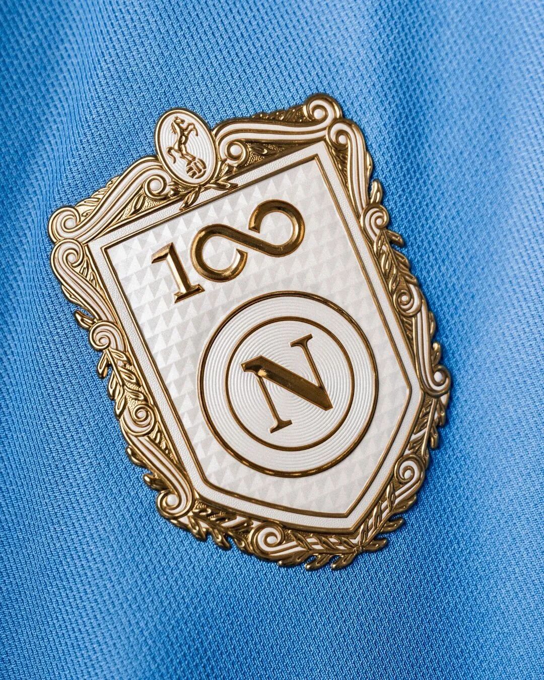
Home – classic Naples blue, but the real story is the away.
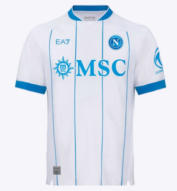
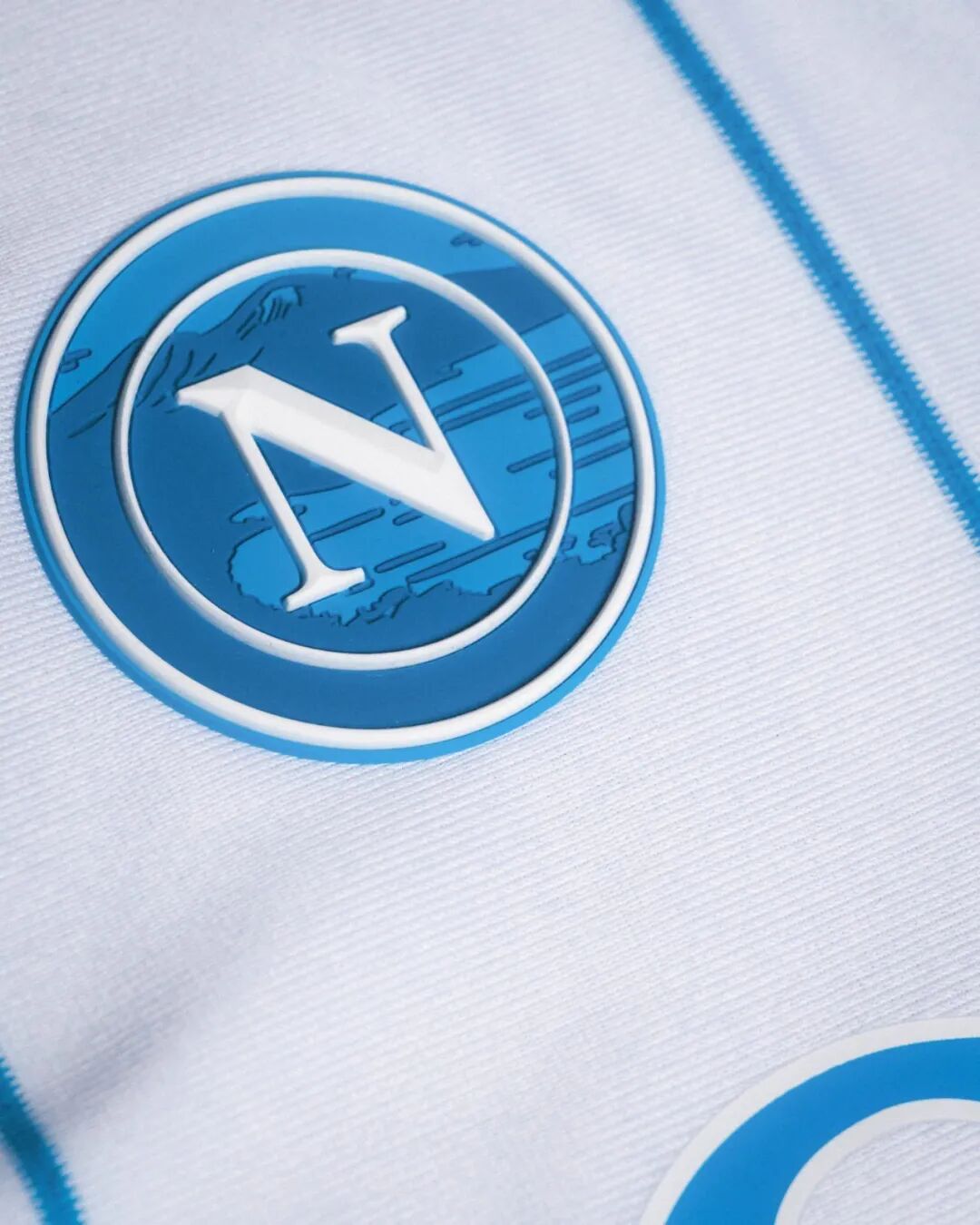
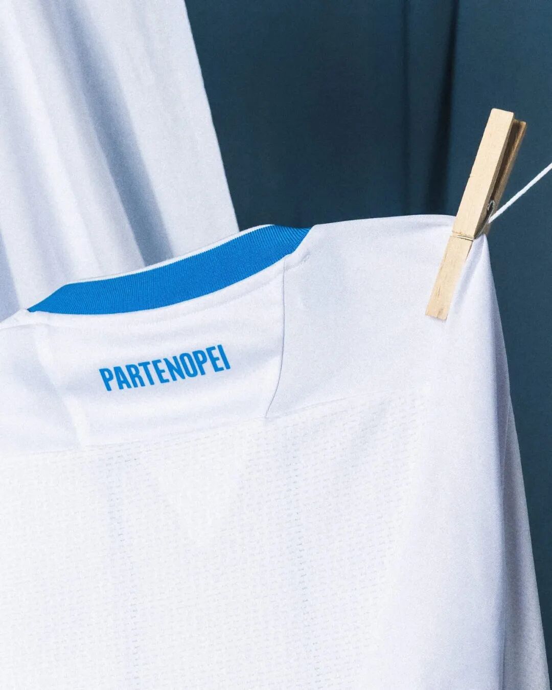
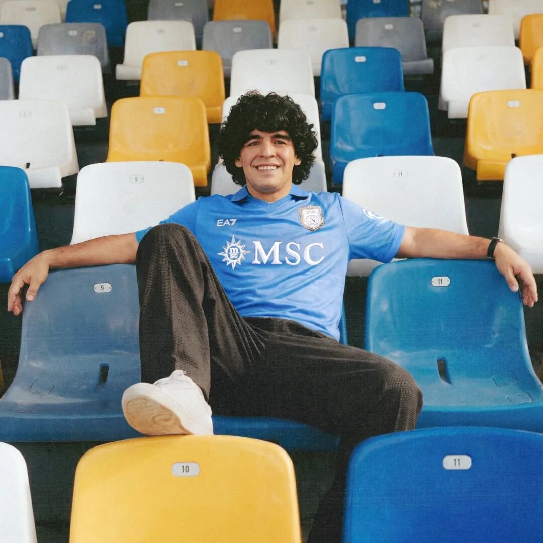
Away ✅ Launched 23 July: Elegant white with Naples blue accents. The crest sits over a silhouette of the Gulf of Naples and Mount Vesuvius. The campaign was filmed in Buenos Aires – La Boca, Caminito, Casa Rosada – telling the story of migration and Maradona's enduring bond. An NFC chip inside offers digital content. Celebrates the club's centenary.
Why it's buzzing: One away shirt tells half the club's history – city, migration, Maradona.
International buzz: Called "the most narratively ambitious release of the summer" – weaving three stories into one shirt.
 3️⃣ Liverpool (adidas)Greatness is Timeless – AI nostalgia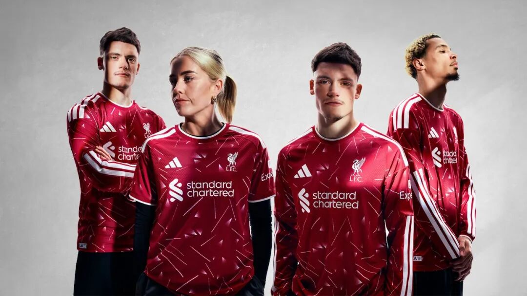
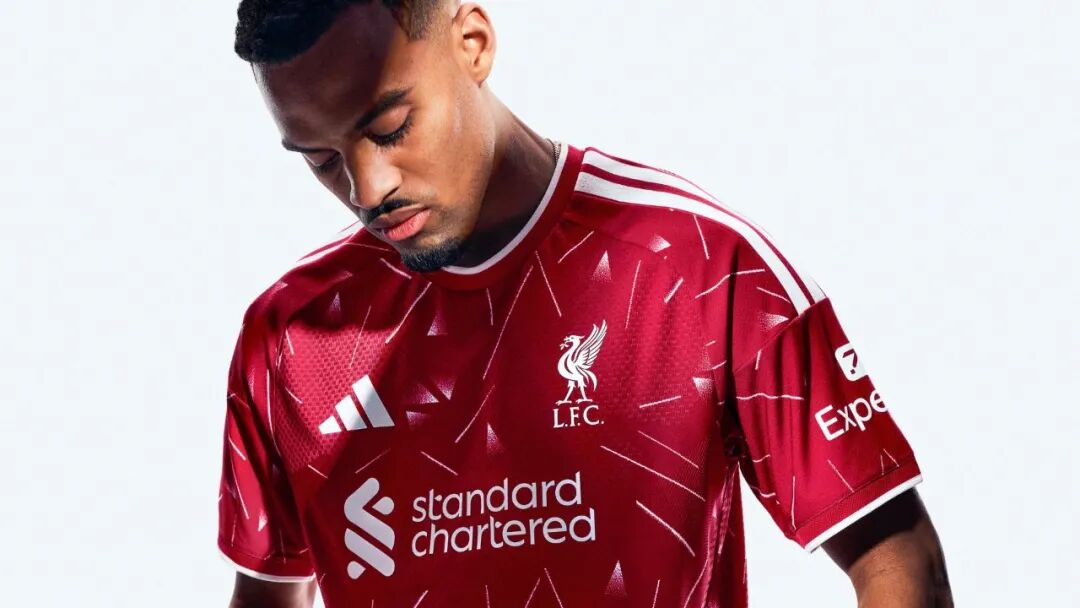
Home ✅ Launched 19 May: A reissue of the 1989–91 "Candy" shirt – deep red with the iconic triangular speckle pattern. The campaign used AI to bring four 1989 legends (Rush, Barnes, Grobbelaar, Hansen) back to life alongside current players. A stunning marriage of tech and tradition.
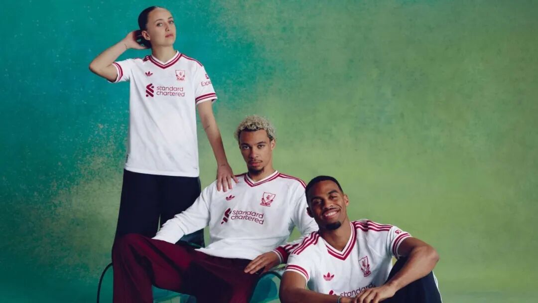
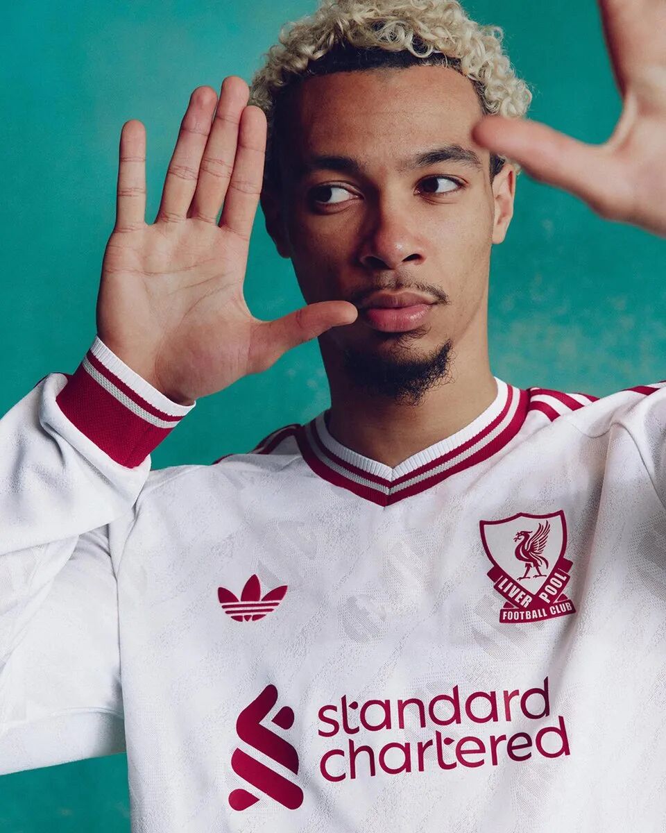
Away – crisp white with maroon logos, and the adidas Originals trefoil replaces the performance logo. A clean, heritage look.
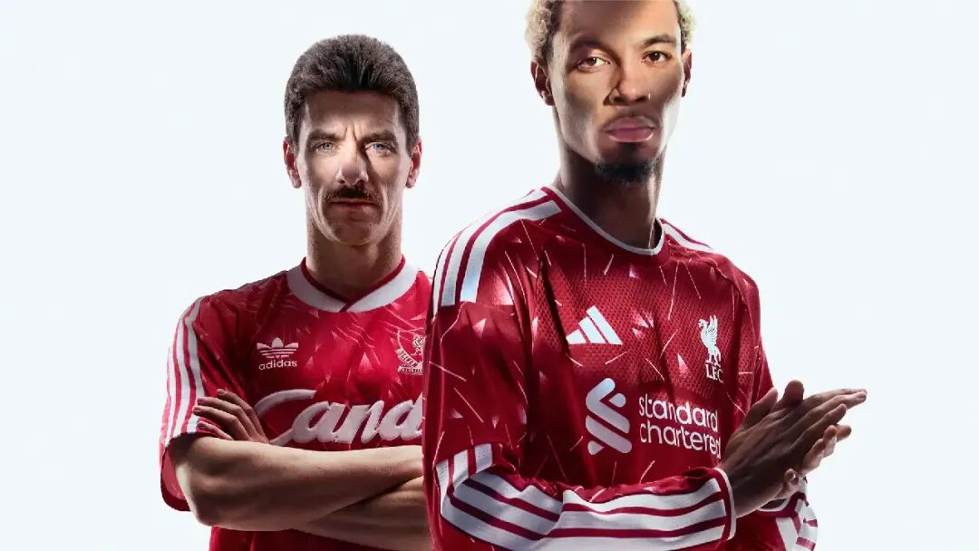
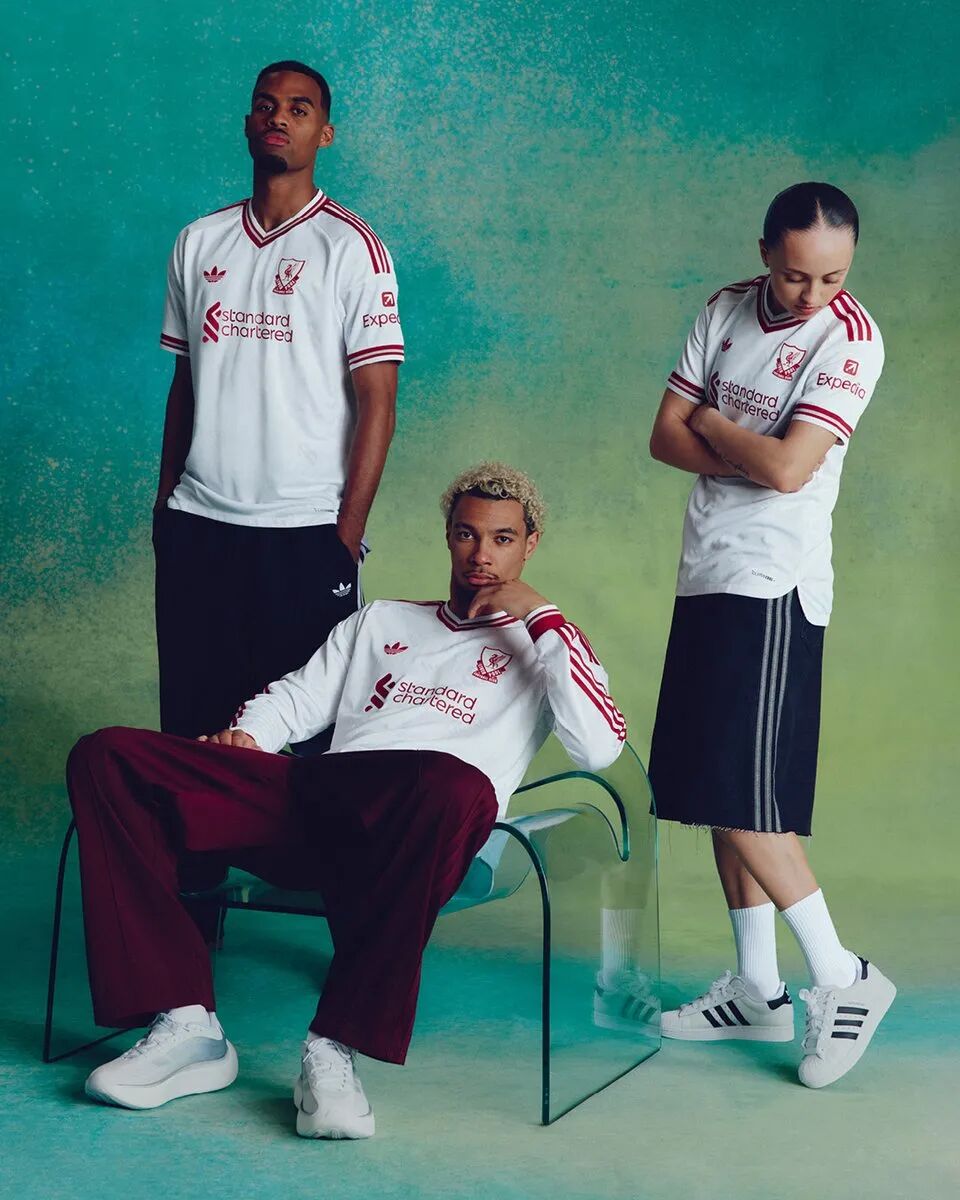
Why it's buzzing: Tech‑driven nostalgia – the most explosive marketing move of the summer.
International buzz: SPORTbible gave the home 9/10 ("a stunning remake of 1989–91"); ESPN ranked it 4th; GiveMeSport listed it in the top 11. The only complaint – the red is darker than previous years, with Footy Headlines calling it "maroon".
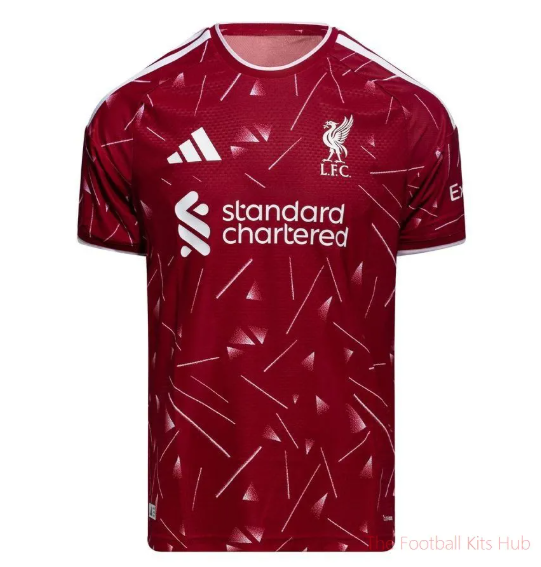
Liverpool Home Jersey
· Candy reissue
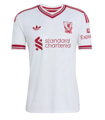
Liverpool Away Jersey
· crisp white
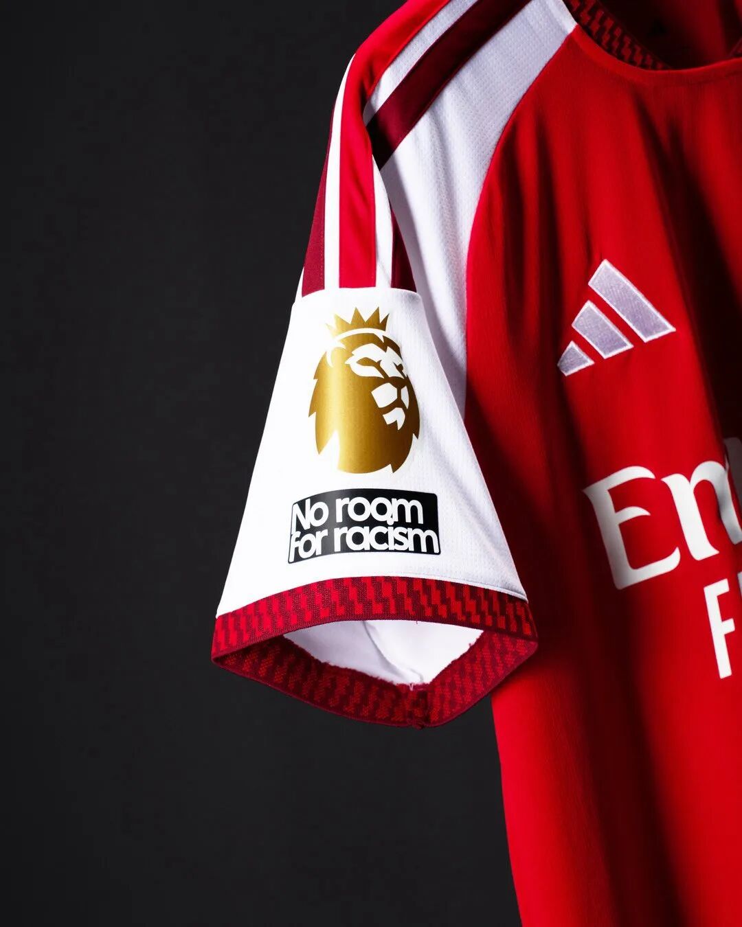
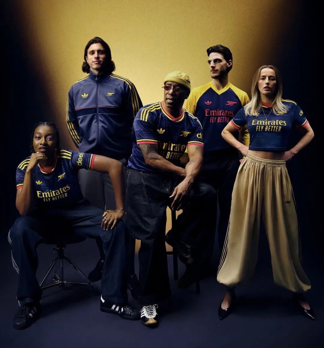
Home ✅ Launched 14–15 May: Classic red‑sleeve white‑body, now in a "redcurrant" shade that echoes the 2004 Highbury farewell. The round neckline takes its curve from the Emirates Stadium roof. And – for the first time ever – gold Premier League champions' badges on both sleeves.
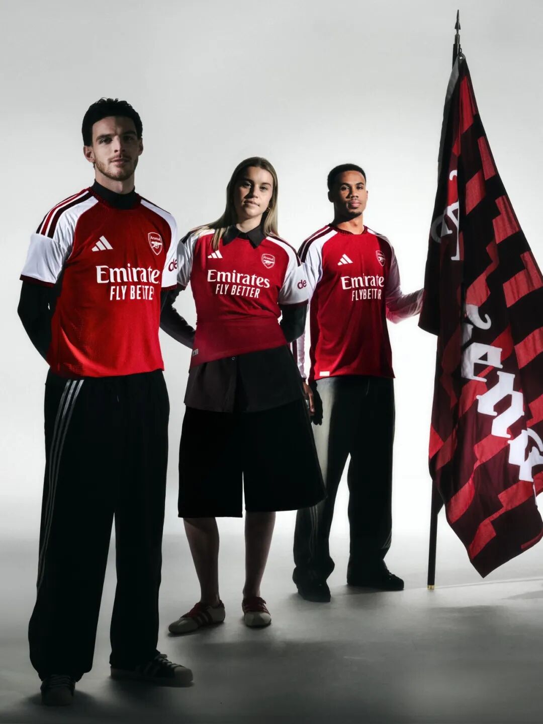
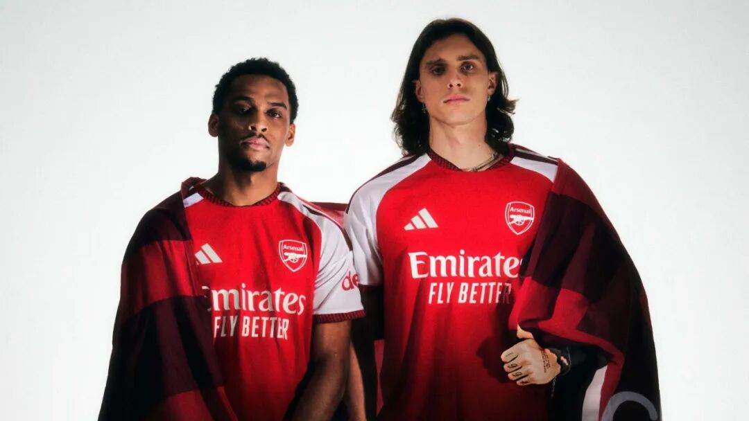
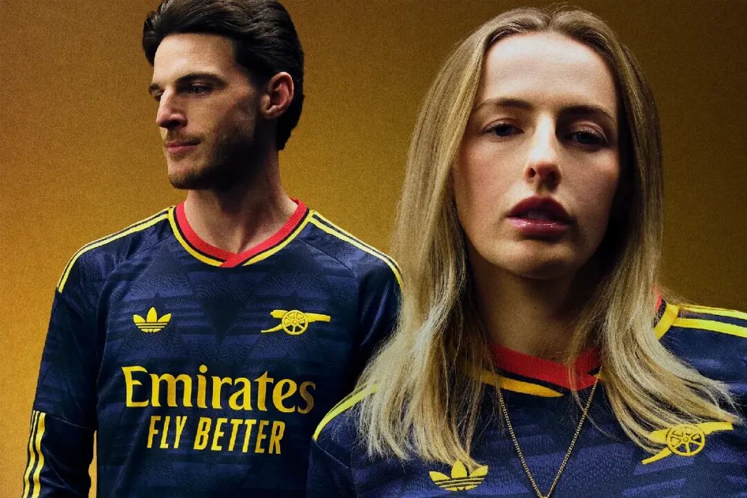
Away – the legendary "bruised banana" 90s JVC design returns, but flipped – navy base with bright yellow and red accents, plus the return of the adidas Originals trefoil.
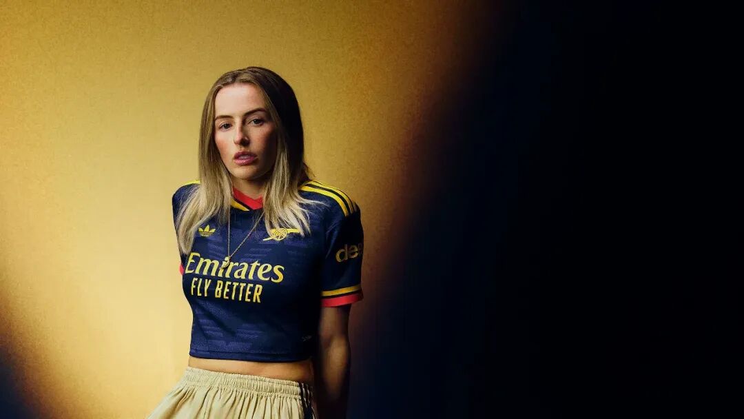 Why it's buzzing: 22 years since the last title, and all three shirts carry the gold badge – the most literal way to stitch "champion" into the fabric.
International buzz: GiveMeSport ranked the home 8th ("not stunning, but screams Arsenal, and that's all a home shirt needs"); SPORTbible gave the home 7.5/10; ESPN, however, placed the away in the bottom 10 of all released kits – a polarising design.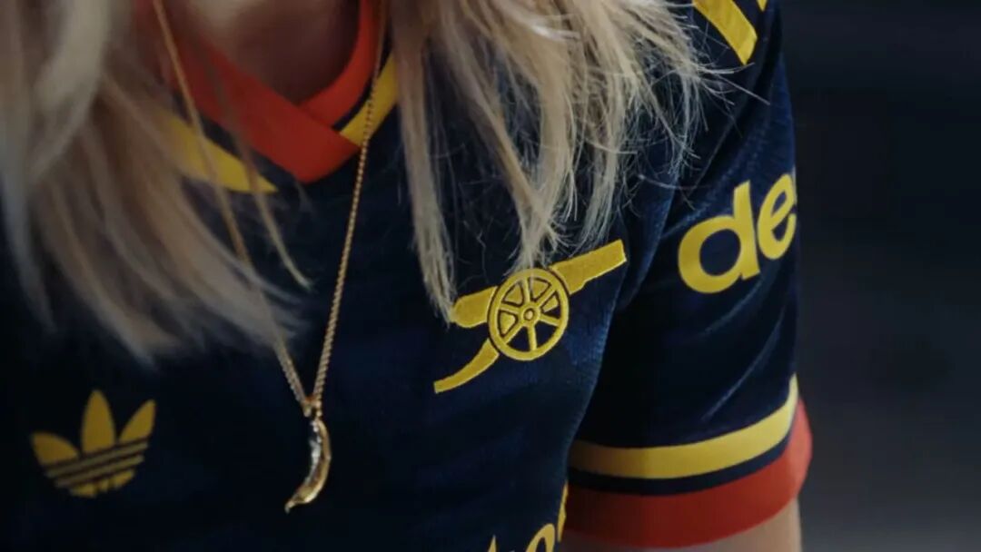
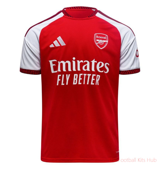
Arsenal Home Jersey
· redcurrant
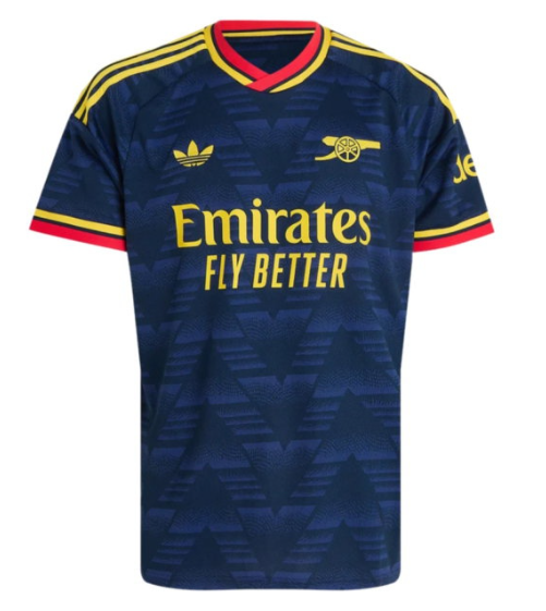
Arsenal Away Jersey
· bruised banana
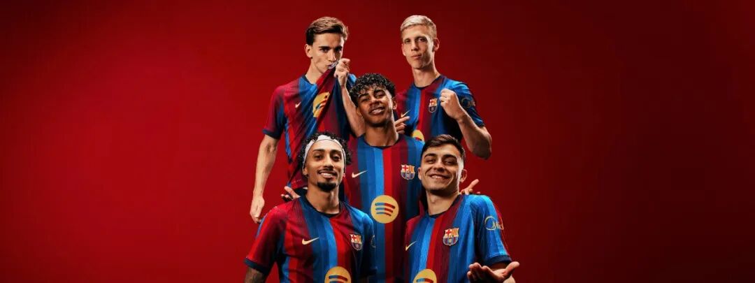
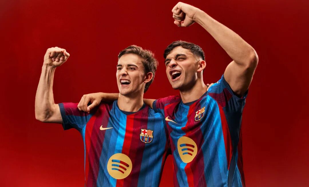
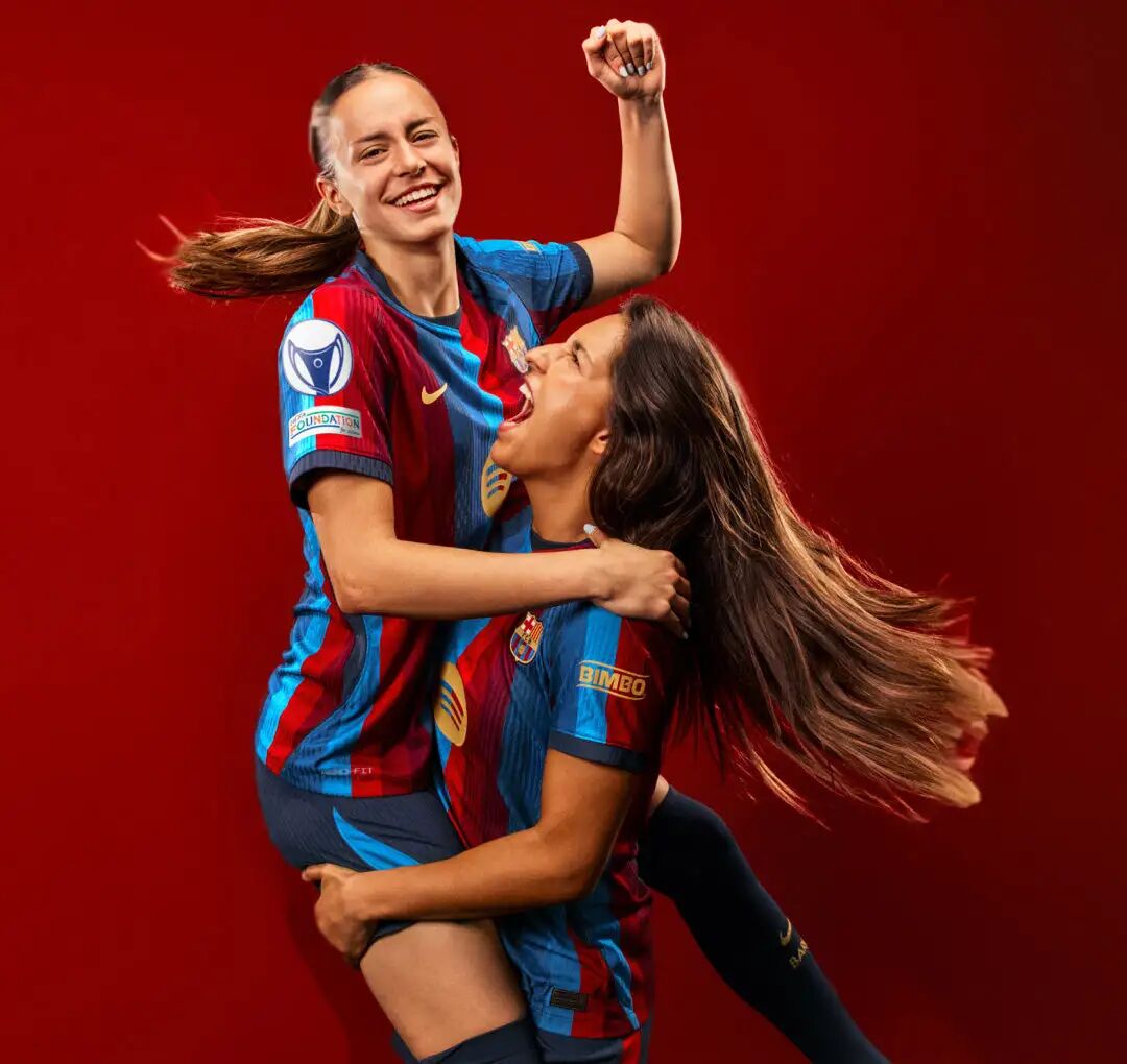
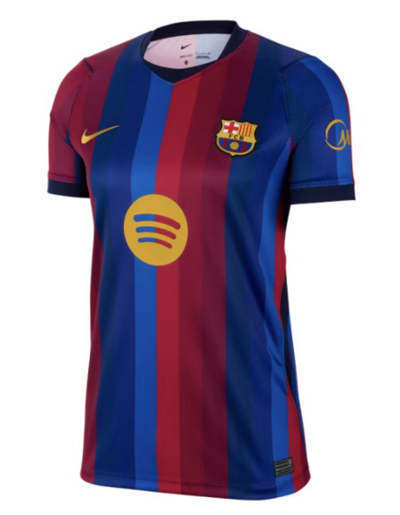
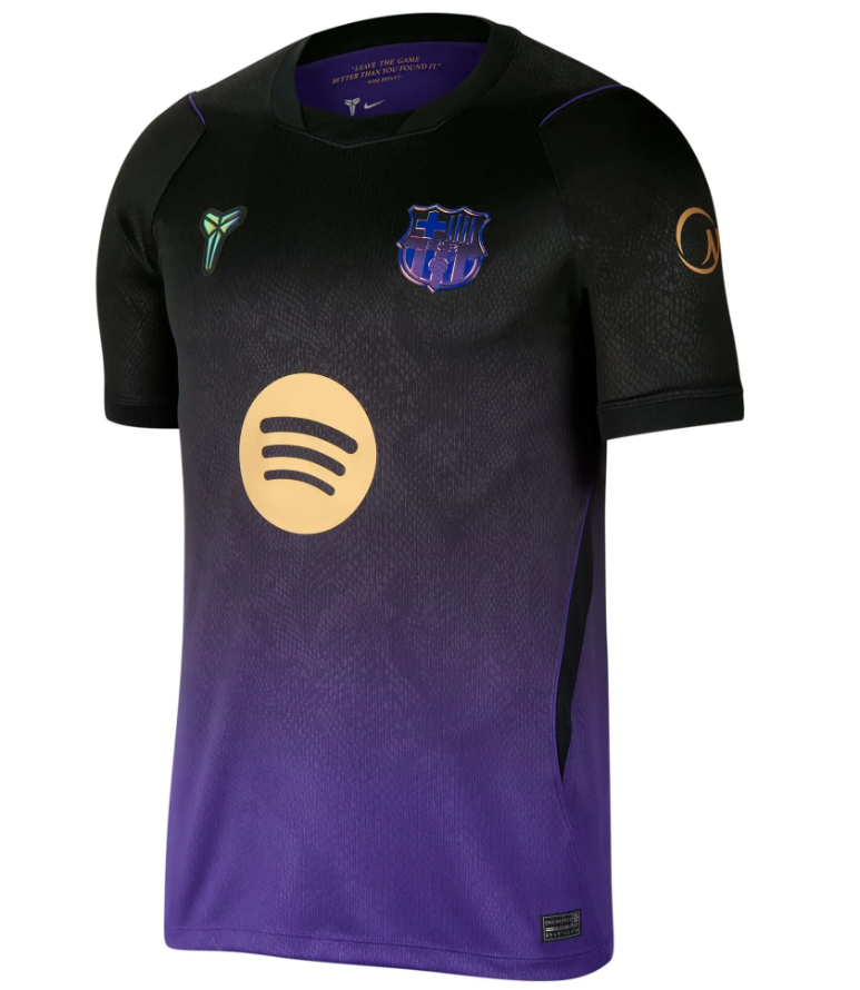
 1️⃣ Barcelona (Nike)Six‑colour gradation + Europe's most expensive kit
Home ✅ Launched 30 June, on sale 1 July: A six‑colour vertical stripe – three shades of red, three of blue – mirroring the newly renovated Spotify Camp Nou façade. The stripes are a reinterpretation of the 2006/07 "Dream Team II" design, with a mineral‑yellow Swoosh for contrast. The launch event was held at MACBA Contemporary Art Museum, and each kit features custom typefaces – a first.
Away – a Mamba tribute, purple and black with gold accents, inspired by Kobe Bryant's Lakers. Inside the collar: "Leave the game better than you found it."
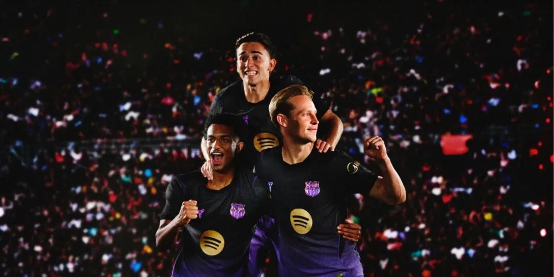
Why it's buzzing: Aesthetic controversy + price controversy – the most polarising release of the summer. No other kit generated as much debate.
International buzz: Footy Headlines noted that "Barcelona used more shades of red and blue than any previous home kit". The €200 price tag (for the match‑issue version) sparked outrage, but also made it the most talked‑about jersey.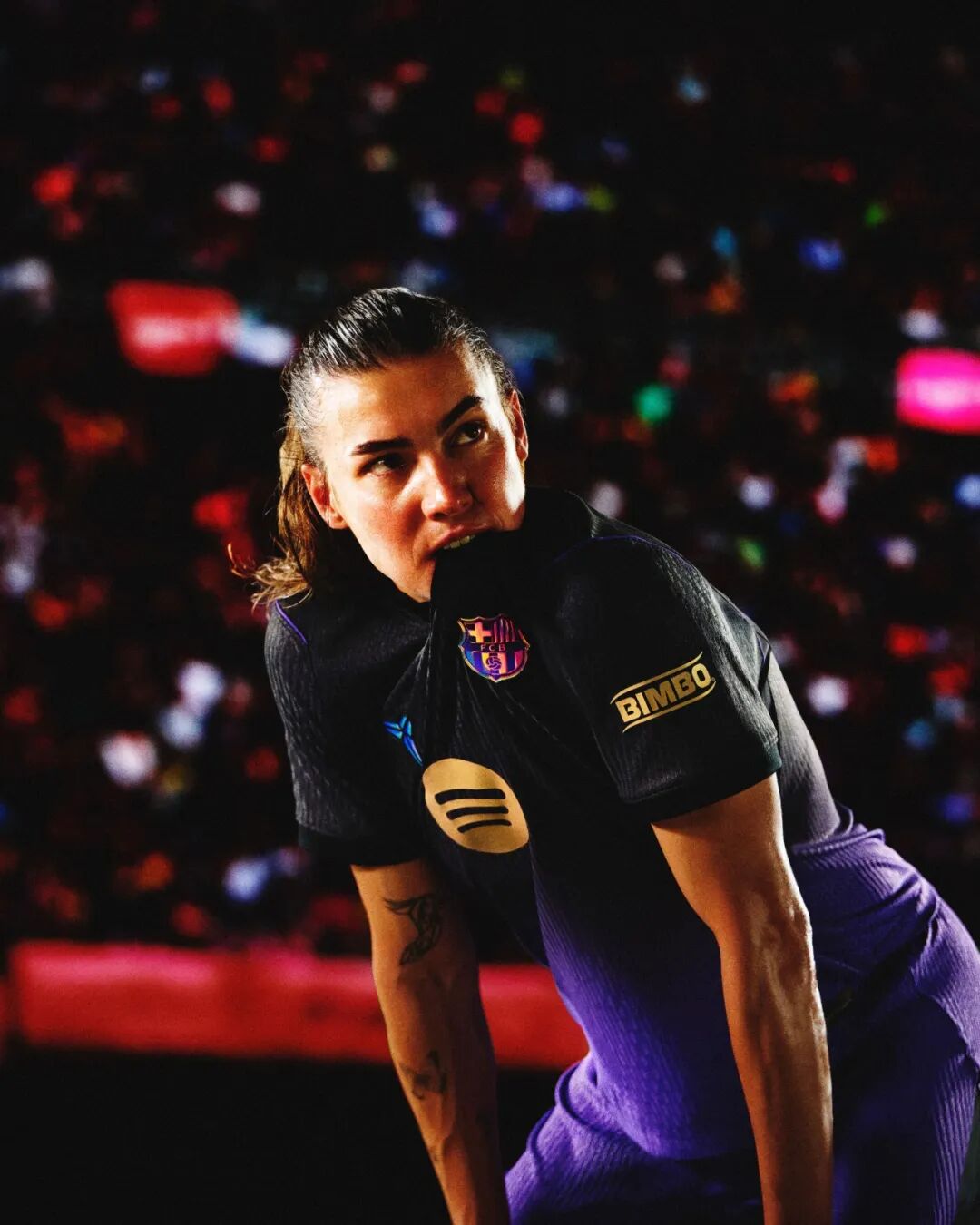
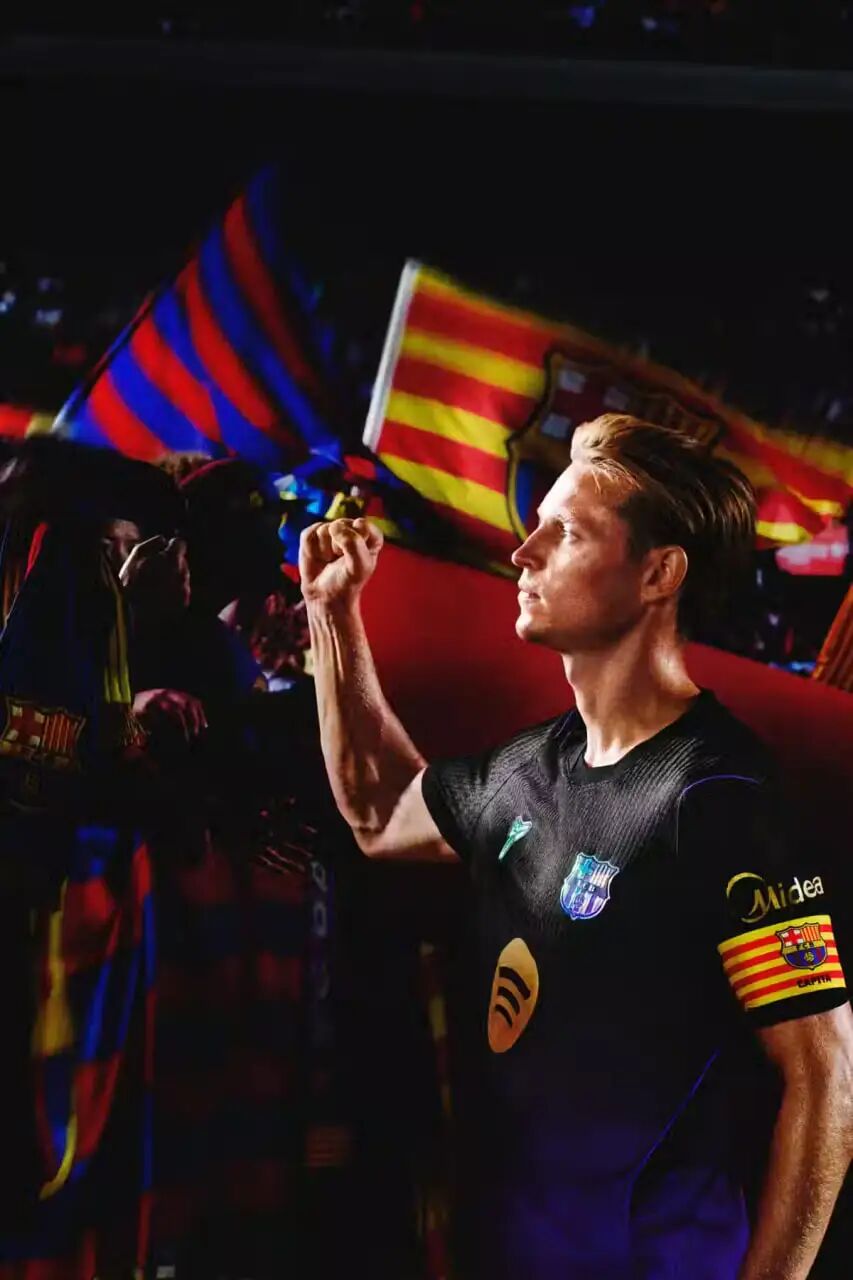
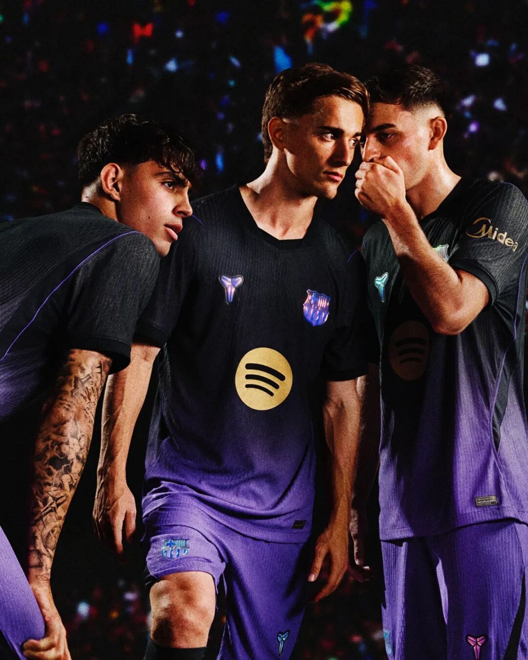
The TOP 10 above focuses on the 2026/27 new season kits from Europe's top leagues, ranked by conversation + international media buzz – not a pure beauty contest. Rankings referenced from ESPN, GiveMeSport, SPORTbible, Footy Headlines, Football Italia, and other outlets.
Of course, everyone has their own TOP 10. Some love classic retro, others crave bold innovation. Some are moved by a pattern, a badge, or a city's culture – others just remember the shirt they won a trophy in. A kit is never just a kit; it carries a club's history, faith, and identity – and it's another language through which fans express their love.
The new season is about to kick off. Whether these shirts become icons will be decided by time, results, and the stories written on the pitch. Drop your favourite in the comments – let's see who wins the real "beauty crown".